The art of visual merchandising to grow your sales

Retail


362 week ago — 5 min read
Sale strategies often focus just on driving traffic into the store. This of course, does not necessarily translate to conversions or buys. Visual merchandising can structure a way a buyer experiences a store and can increase conversion rates for buys, ensuring that you are able to sell your product and get the best return for your investment on stock. Visual merchandising has been described as, “The products being sold are typically displayed in such as way as to attract consumers from the intended market by drawing attention to the product's best features and benefits.”
‘Red’, the most popular and preferred colour among brands, retailers, shop owners—big and small— is used in order to grab the attention of passers-by and entice them to enter their stores. Combined with the oft used over-sized text message emphasising a discount or sale, shoppers are bound to throng the store. This combination of the colour Red along with a sale message is the classic bread and butter duo, impossible to go wrong with it.
Yet, malls and marketplaces teaming with retail outlets, run their discounts simultaneously; making it tough to distinguish one retailer from another with rows upon rows of red banners all shouting ‘Sale’. Minor variances such as the typography often go unnoticed. A pre-decided preference for one brand over the other helps customers navigate the mall, but what about the retailer; can they attract newer customers in this critical period of the year?
The success behind the combination of the colour red with sale employs three basic principles; colour, size and isolation. Red, a colour known to stop us in our tracks, (think of red signal signs, the red dress, the pouting red lips.) Next, the message takes over, either by way of size (over or undersized as done by Zara) and often in isolation, thus creating a highlighted message.
Some retailers do use a similar methodology sans these overused elements to communicate their message, loudly, clearly and differently. The cue lies in the words ‘loudly, clearly, differently’. An effective message is one that grabs eyeballs, makes passers-by pause, interacts and intersects their course of path.
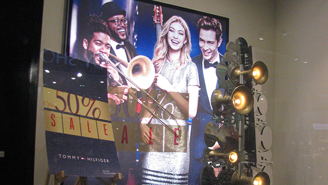
This season, blowing its own trumpet is the brand Tommy Hilfiger. With a cluster of bright incandescent lights embedded in the bell shaped horns, fused into the metallic 2D sculpture, this larger-than-life prop piece is sure to get your attention due to its form and the higher lux levels emitted. It complements the brand imagery of popular American model Gigi Hadid, the brand ambassador along with a jazz band in the signature holiday collection. The Sale text in muted gold, is secondary communication, yet bold and clear. All at once, the message through this window display is eclectic, playful and bold, in a preppy with a twist style reminiscent of the brand’s personality.
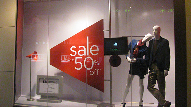
Loudspeakers being the cue, Lifestyle international—from the Landmark group in UAE — followed suit. With a visualisation of the loudspeaker’s blare, the angular red quadrangle announces the Sale. Two stylishly dressed mannequins are fronted by a blinking sensor screen with a hand-print inviting interaction from onlookers. By placing a palm on this sensor, it shows the number of likes this window display has accumulated. In a matter of half an hour, it clocked over 40 likes. Wouldn’t it be interesting to know the total likes accumulated over the course of 10-12 shopping hours per day through an entire End-of-Season-Sale duration?
Not only is this an effective tool for measurability of interaction, it is also successful in creating customer engagement and brand retention. In an increasingly digitised age, it is a small but concrete step by a retailer to merge bricks with clicks, integrating social media on the storefront to gain traction.
A few other brands to have effectively used alternative colours are Park Avenue with 3D matte gold letters, Allen Solly and with their customary canary yellows and only with hot pink.
In conclusion, for brands and retailers looking to cut across the clutter, there is still room for innovation moving beyond the time tested red sale banners. With a little effort, your window displays can be; clear, different, interactive, innovative, emphasising and resonating the brand’s personality. So, go on and let your smart sale strategies make cash registers ring!
To explore business opportunities, link with me by clicking on the 'Invite' button on my eBiz Card.
Disclaimer: The views and opinions expressed in this article are those of the author and do not necessarily reflect the views, official policy or position of GlobalLinker.
Posted by
Namrata SachdevNVISAGE is a creative service offering Strategic Retail Design Solutions, enhancing Business & Profitability. Practice areas — Creating Concepts for Retail...
View Namrata 's profile
Other articles written by Namrata Sachdev
The coming of age of Indian retail
358 week ago
Most read this week
Trending
Ecommerce 26 Mar 2025
Comments
Share this content
Please login or Register to join the discussion